LOGO DESIGN

Logo design

A logo is more than a shape you happen to like. At zoudesign, we start by listening, then work with you to put what makes your shop or company special into words as a concept.

WHY

Why logo design matters

It is the first thing people see

On signboards, business cards, packaging and social media, people see your logo before they know anything else about you.

You will use it for years

Once made, a logo stays with you for a long time. Building it on how you run your business, rather than on passing trends, keeps it from feeling dated.

It anchors your brand

The concept we shape while designing the logo also guides decisions about your shop, your menu and what you share.

FLOW

How a logo comes together

In the first two steps, we build the concept, the foundation of the design, together with you. The more care we put in here, the clearer the design becomes and the longer the logo lasts.

  1. STEP 1 Interview

    With you

    We ask why you started, who you want as customers, what sets you apart and where you are heading. As we talk, we help put into words the things that are hard to express.

    Result: Notes on your business and customers

  2. STEP 2 Concept design

    With you

    From the interview, we summarize the target, goals, message, keywords and color direction, and review them with you before any design work starts.

    Result: Concept sheet

  3. STEP 3 Design proposal

    Based on the concept, we design the lettering, mark and colors, and explain how each choice connects to the concept.

    Result: Logo proposals

  4. STEP 4 Refinement

    With you

    We adjust the design based on your feedback and check how it looks on business cards, signboards, social media icons and more.

    Result: Final logo

  5. STEP 5 Guidelines

    We put color specs, clear space and misuse examples into a logo manual, so the logo looks the same no matter who uses it.

    Result: Logo manual

  6. STEP 6 Delivery

    We deliver files for print and web, and are happy to advise on how to use them after delivery.

    Result: Complete logo files

Logo design100,000 JPY (guidelines included)≈ US$630
See pricing details
CASE STUDY

Case study

A project that included a concept sheet and a logo manual.

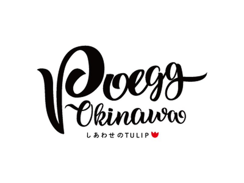
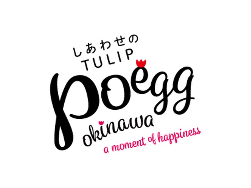
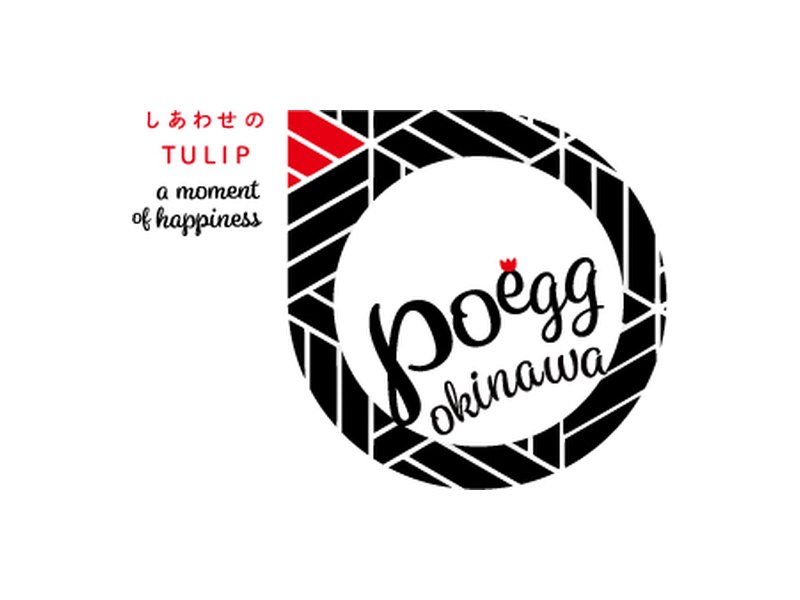
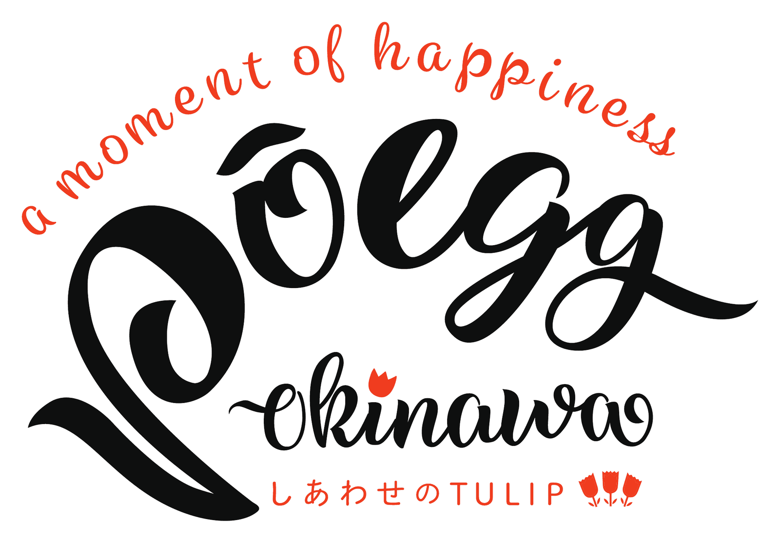
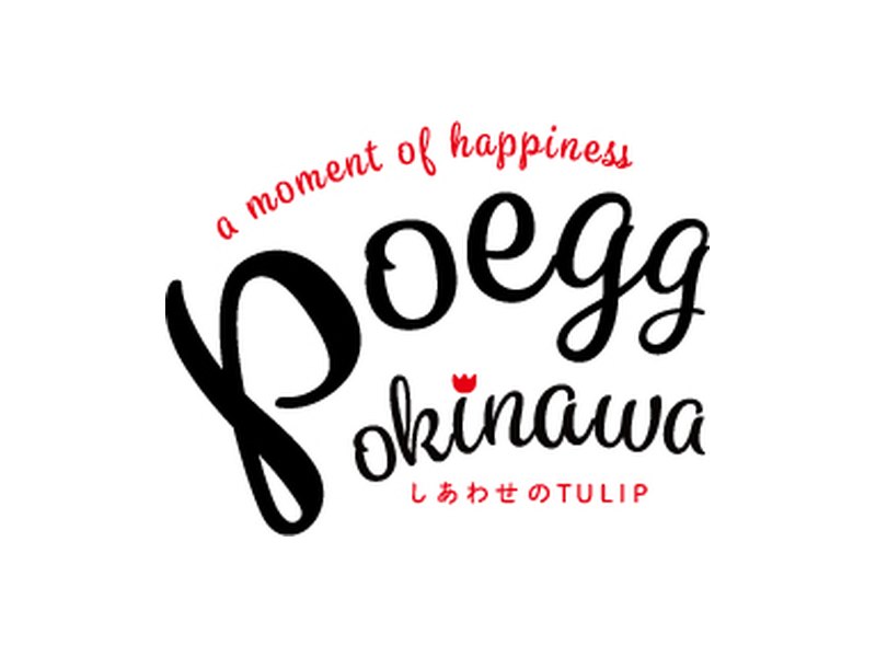
POEGG OKINAWA logo: "POEGG" and "okinawa" in black script, surrounded by a red arc reading "a moment of happiness" and "Shiawase no TULIP"
August 2019 · Logo design and logo manual

POEGG OKINAWA

A burrito-style take on the Okinawan pork and egg onigiri

Concept

A new kind of "PORK TAMAGO ONIGIRI"

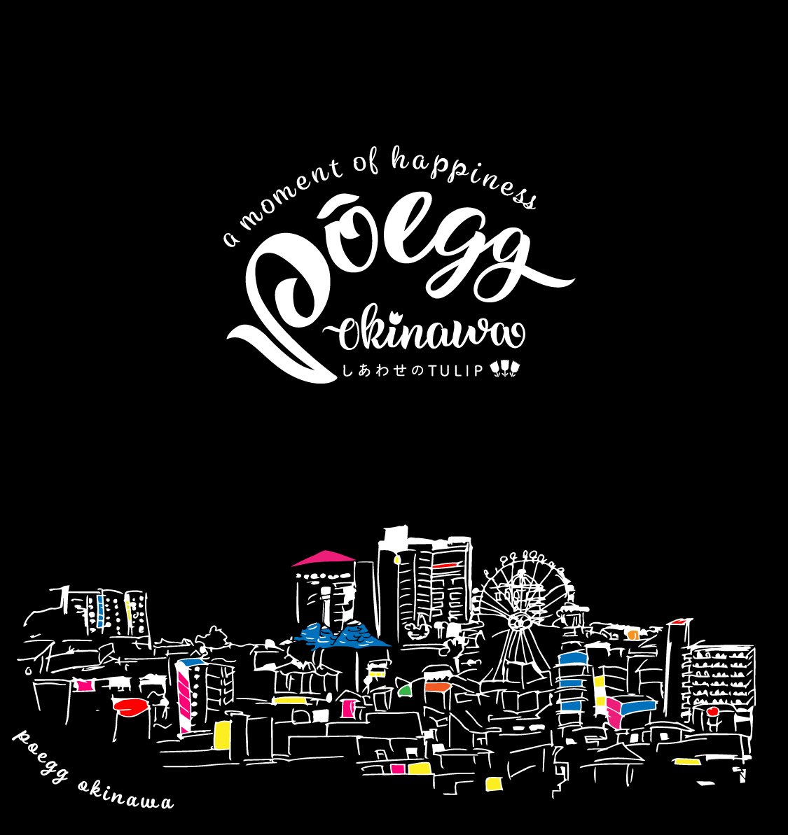
A new burrito-style pork and egg onigiri that is easy to eat with one hand. To break away from the usual image of the dish, we gave the logo an American feel. The black lettering stands for nori seaweed, the red accent for pork, and the design also ties in with TULIP luncheon meat.

Target

  • First: tourists
  • Second: locals
  • Frequent Instagram users who share photogenic food
  • Trend-conscious people

Goals

  • Grow a fan base
  • Gain Instagram followers

Colors

  • Black (nori)
    #000000 CMYK K100
  • Red (pork)
    #FF4B00 CMYK M85 Y95
Design process (including proposals not chosen)

First proposal

To explore broadly, we proposed seven directions with different colors and moods, shown on paper bags, cups and signboards. Through discussion, we narrowed it down to the American-style script.

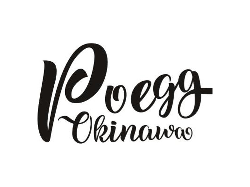
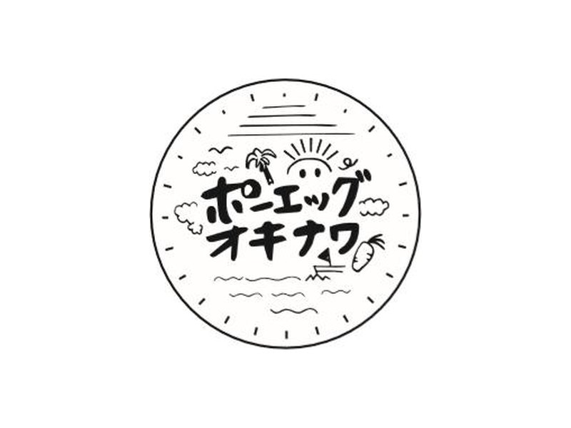
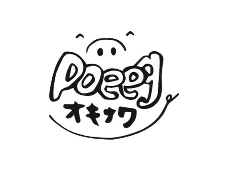
  • POEGG OKINAWA logo, First proposal, Option A
    Option A
  • POEGG OKINAWA logo, First proposal, Option B
    Option B
  • POEGG OKINAWA logo, First proposal, Option C
    Option C
  • POEGG OKINAWA logo, First proposal, Option D
    Option D
  • POEGG OKINAWA logo, First proposal, Option E
    Option EChosen direction
  • POEGG OKINAWA logo, First proposal, Option F
    Option F
  • POEGG OKINAWA logo, First proposal, Option G
    Option G
Second proposal (February 2019)

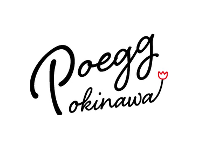
Building on the script, we created five options that varied the lettering layout and how "Shiawase no TULIP" and "a moment of happiness" were placed. The chosen option was refined and documented in the logo manual.

  • POEGG OKINAWA logo, Second proposal (February 2019), Option A
    Option AChosen direction
  • POEGG OKINAWA logo, Second proposal (February 2019), Option B
    Option B
  • POEGG OKINAWA logo, Second proposal (February 2019), Option C
    Option C
  • POEGG OKINAWA logo, Second proposal (February 2019), Option D
    Option D
  • POEGG OKINAWA logo, Second proposal (February 2019), Option E
    Option E

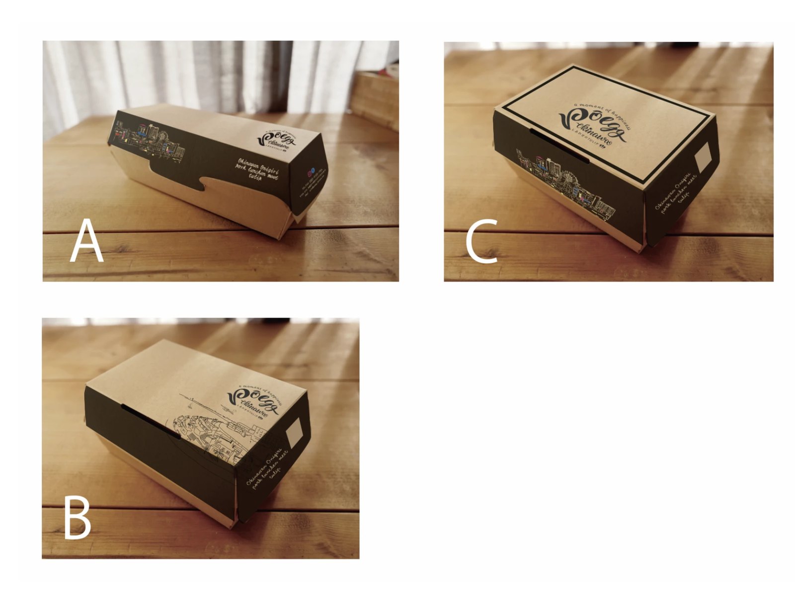
Applications

WORKS

More logos

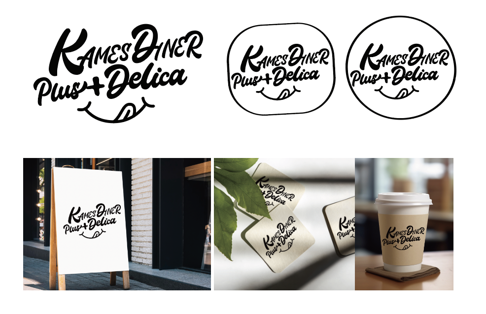
Script logo "KAMES DINER Plus+Delica" with a smiling mouth, shown on a signboard, coasters and a coffee cup
LOGOKAMES DINER Plus+Delica
Egg-shaped logo combining a chicken character holding a beer mug with a red ribbon reading "Toriko #Awase"
LOGOToriko Awase
See all work

Tell us about your business

From opening a new shop to refreshing the logo you have now, we can start before your ideas are fully formed and sort them out together.